Retail Store Design: Layouts, Lighting, and Merchandising
 Chase Binnie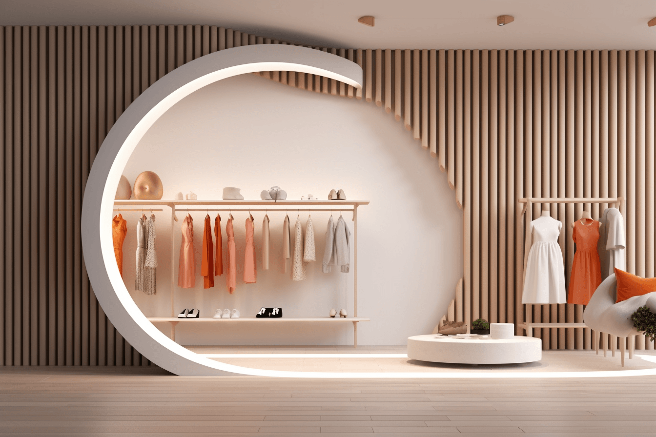
Retail store design is how you shape a physical store — its layout, lighting, fixtures, color, and technology — to guide shoppers, show products in their best light, and turn foot traffic into sales. Good design does two jobs at once: it makes the store easy to move through, and it makes people want to buy. This guide covers the store layouts, merchandising tactics, and in-store technology that separate a store that converts from one that simply holds inventory.

- What is retail store design?
- Retail store layout types
- Layout fundamentals: visibility, pathways, and power walls
- Lighting and color
- Visual merchandising and in-store experience
- Technology in retail store design
- Frequently asked questions
What is retail store design?
Retail store design is the planned arrangement of a store's physical space and elements — floor plan, fixtures, lighting, color, signage, and merchandising — to create an environment that fits the brand and moves customers toward a purchase. It matters because layout and atmosphere directly shape how long people stay, how much they see, and how much they buy. A store that is easy to navigate and pleasant to be in earns longer visits, larger baskets, and more repeat trips. Every design choice should serve the target shopper: who they are, what they came for, and how they like to browse.
Retail store layout types
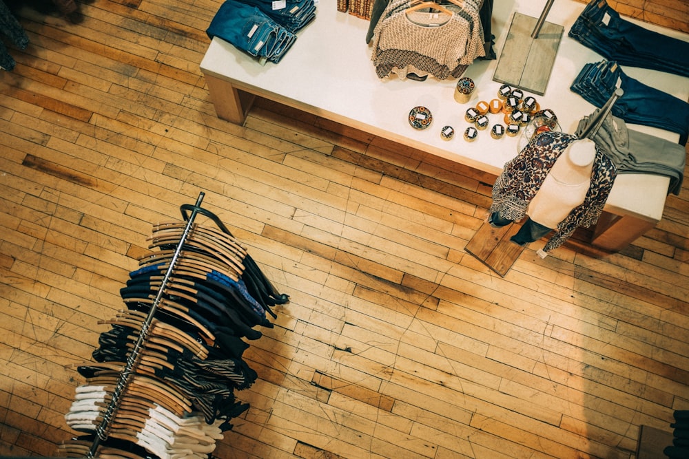
The floor plan is the foundation of store design. It sets the path customers take, the products they pass, and how efficiently staff can restock. These are the main retail store layouts and where each one works best.
Grid layout
Straight, parallel aisles that intersect at right angles — the classic supermarket plan. The grid maximizes product density and is easy to navigate, which is why grocery stores, drugstores, and big-box retailers use it. It suits shoppers who value speed and predictability over discovery.
Loop (racetrack) layout
A defined path that circles the store and returns shoppers to the entrance, with displays along the perimeter and in the center. Because customers pass most of the merchandise on the way around, the loop is ideal for department stores and large formats that want maximum product exposure. Target and Macy's use variations of this approach.


Free-flow layout
No fixed path. Fixtures and displays are placed to invite open exploration, often along curved lines. Free-flow suits boutiques and higher-end stores where browsing and dwell time matter more than throughput, and where fewer SKUs give each product room to breathe.
Zone layout
The space is divided into distinct areas by product category or brand, each with its own look. Zones make large assortments easy to shop and let a retailer set a different mood for, say, activewear versus formalwear within the same store.
Angled / diagonal layout
Shelving and racks set at angles rather than square to the walls. Diagonal sight lines pull the eye across more of the store and create a more dynamic feel, at the cost of some floor efficiency — a common choice in specialty and upscale retail.
Geometric / island layout
Freestanding display "islands" connected by aisles. Islands spotlight featured or high-margin products and give the space visual variety, while still letting customers find specific items quickly.
Forced-path layout
A single predetermined route that walks shoppers past the entire assortment before they reach checkout — IKEA is the best-known example. It maximizes exposure and impulse purchases but frustrates customers who want to get in and out fast, so it works best when discovery is part of the trip.
Straight / spine layout
A single main aisle runs from the entrance to the back of the store, with products branching off it. Shoppers can see most of the store at a glance, which makes it intuitive and well suited to smaller shops or quick, easy build-outs.
Layout fundamentals: visibility, pathways, and power walls
Whichever layout you choose, a few fundamentals decide whether it works.
Visibility. Make key products easy to see from the entrance and from a distance. Place high-demand or high-margin items in high-traffic spots — near the entrance, at eye level, and around the checkout — so customers notice them without searching.
Pathways and power walls. Guide shoppers through the space with clear walkways that never feel cramped or overwhelming. A "power wall" — a large, well-styled section of wall on the customer's natural line of sight — is prime real estate for new arrivals, seasonal goods, or hero products.
Aisle widths and shelf heights. Design for restocking as well as browsing. Aisle widths, shelf heights, and display depths should give staff easy access to replenish inventory quickly, so the store stays full and shoppable through peak periods.
Lighting and color
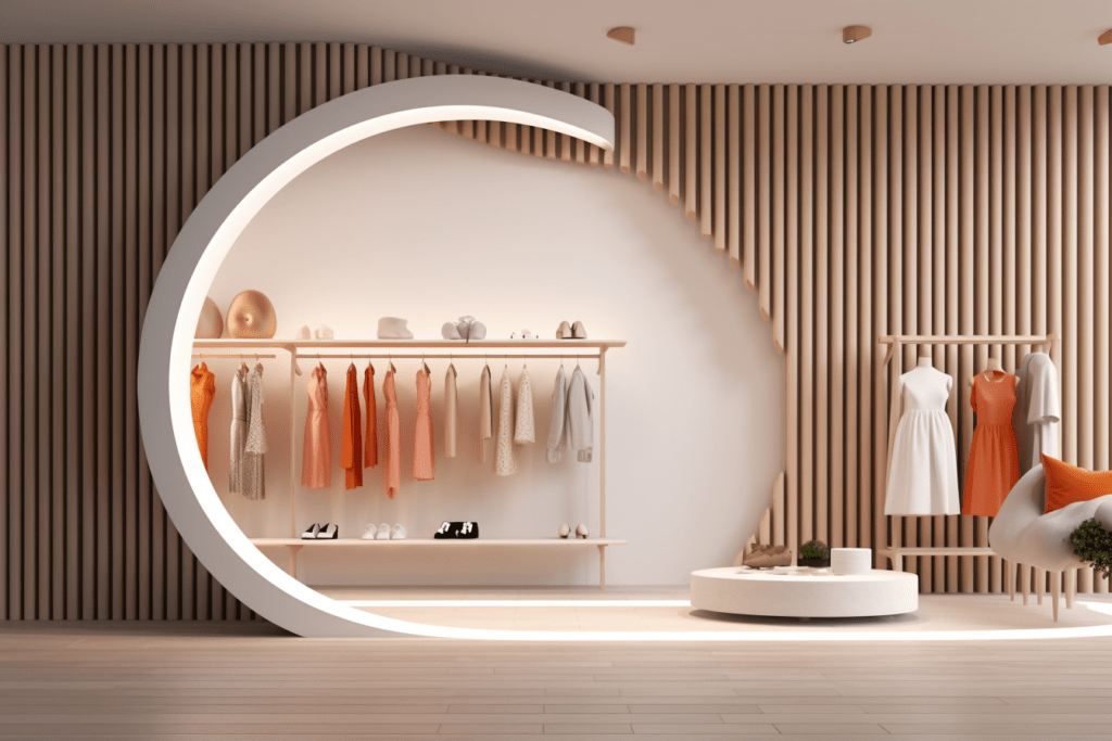
Lighting sets the tone of a space and directs attention. Use natural light where you can, then add task lighting — brighter, focused fixtures — on the products and sections you most want customers to notice, such as feature tables and sale areas. Softer, lower light in fitting rooms and lounge areas encourages people to slow down and stay longer.
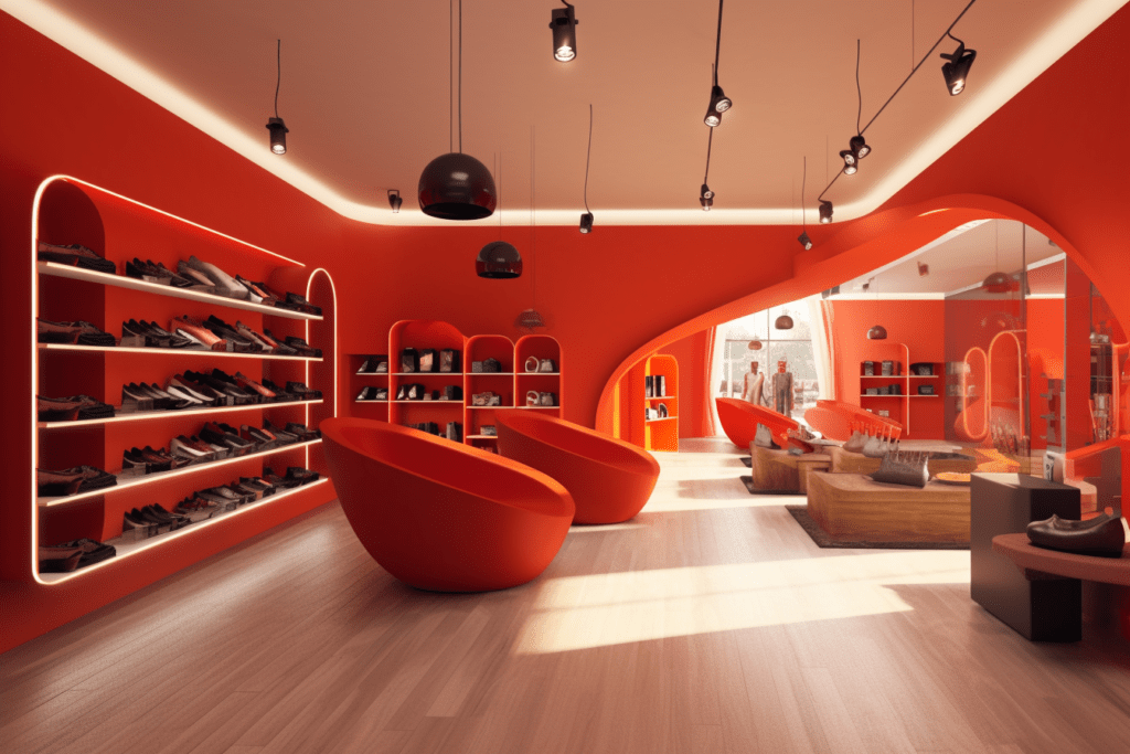
Color works the same way. Bright, saturated colors draw the eye and work well as accents, while neutral tones create contrast that makes product details stand out. Grouping items by color — color blocking — makes displays easy to read at a glance. Choose a palette that matches the mood you want, whether that is calm and premium or energetic and playful.
Visual merchandising and in-store experience
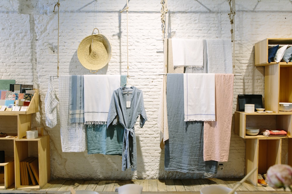
Visual merchandising is the craft of building displays that catch attention and move product. Start by matching the display to the merchandise — mannequins and styled vignettes sell apparel far better than a folded stack on a shelf — and keep products organized and clearly labeled so shoppers can find what they came for. A handful of tactics consistently earn their space:
- Window displays. The exterior window is a passerby's first impression of your brand and often the deciding factor in whether they walk in. An inventive, well-lit window can pull in traffic on its own.
- Treat the store like a gallery. For higher-end goods or a smaller assortment, display fewer items with more space and intention. Curated presentation signals value and invites unhurried browsing.
- Photo-worthy installations. A distinctive, brand-defining spot that customers want to photograph turns visitors into free advertising when they share it, especially if your name and products are in frame.
- Behind-the-scenes storytelling. Show how products are made. This builds trust and interest, and is especially powerful for handmade, organic, or made-in-USA goods.
- Music. A playlist matched to your brand and audience improves the mood and dwell time. Keep the volume moderate and the content inoffensive so it supports the experience instead of distracting from it.
Digital signage and interactive kiosks extend visual merchandising by delivering real-time pricing, promotions, and product information without tying up staff.
Technology in retail store design
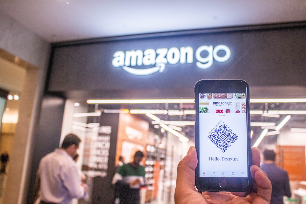
Technology should make the store faster to shop and easier to run. The most useful additions to a modern store design:
- Automated checkout. Self-checkout and mobile payment cut lines at the register and capture purchase data you can use to refine assortment and promotions.
- Digital signage. Screens update pricing, promotions, and product details instantly, and interactive displays let customers look up information on demand.
- Augmented reality. AR lets shoppers "try before they buy," which builds confidence, cuts returns, and shows you what customers are interested in.
- Smart shelving. Sensor-equipped shelves track stock in real time, flag low inventory automatically, and can support dynamic pricing — freeing staff from manual counts.
- AI chatbots. On-screen assistants answer common questions around the clock and gather feedback you can feed back into layout and merchandising decisions.
- QR codes. Codes on shelf tags, products, or exterior signage give shoppers instant access to details, videos, coupons, or sign-ups — and can draw passersby inside.
Frequently asked questions
Why does store design matter in retail?
Store design shapes how customers experience a brand and how much they buy. An inviting, easy-to-navigate store keeps shoppers browsing longer, exposes them to more merchandise, and encourages repeat visits — all of which lift sales and loyalty.
Which store layout is best?
There is no single best layout — the right one depends on your products, space, and shoppers. Grid layouts suit high-efficiency formats like grocery; loop and forced-path layouts maximize product exposure in department stores; free-flow and zone layouts fit boutiques and specialty retail where browsing matters most.