Starbucks Logo History: The Siren and Its Evolution
The Starbucks logo has been redesigned three times since 1971, but the siren at its center has never left. What began as a brown, twin-tailed siren on a Seattle coffee-bean shop is now one of the most recognized marks in the world. Here is how the design changed across the 1987, 1992 and 2011 redesigns.
The original 1971 Starbucks logo
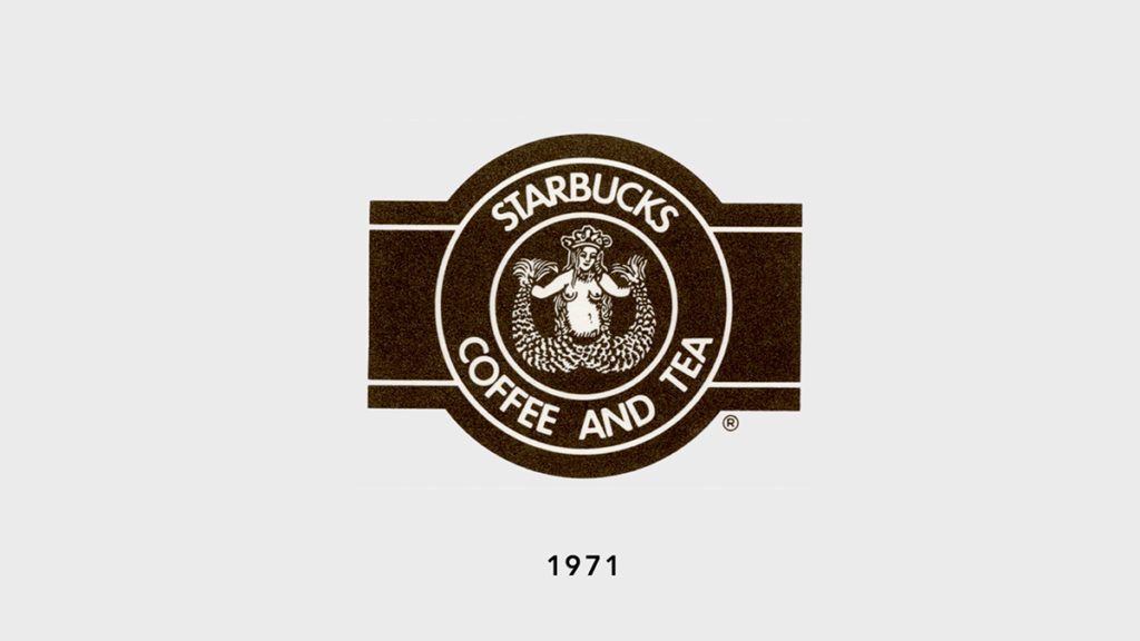
Starbucks opened in 1971 in Seattle, Washington, selling whole coffee beans and tea rather than the brewed drinks the brand is known for today. The first logo drew on the city's maritime history and the seafaring trade that carried coffee. It featured a bare-breasted, two-tailed siren from Greek mythology, based on a sixteenth-century Norse woodcut, shown in full inside a brown circular badge ringed by the words "Starbucks Coffee Tea Spices."
The 1987 redesign: brown to green
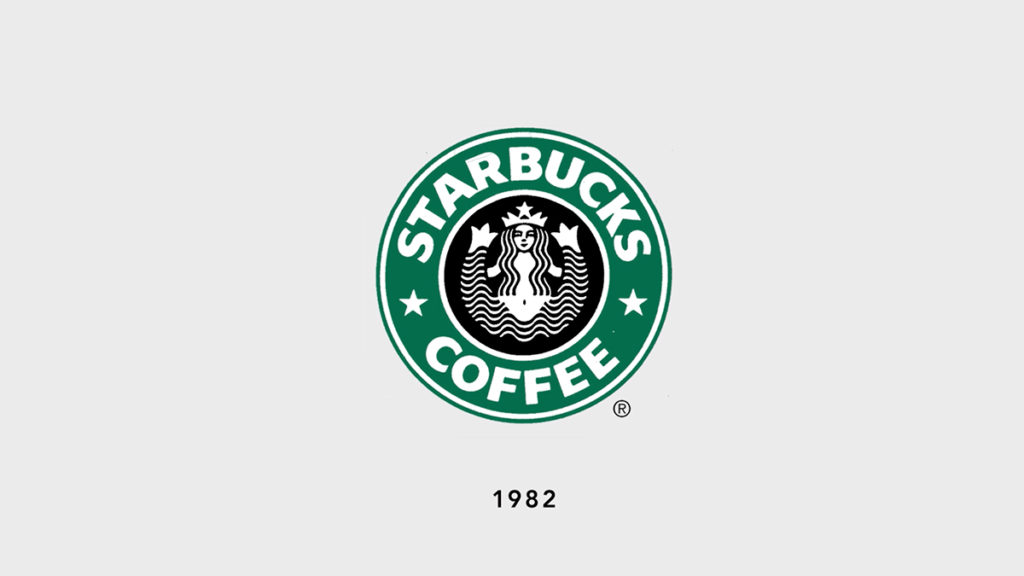
When Howard Schultz's Il Giornale acquired Starbucks in 1987, the company reworked the logo to match a new coffeehouse vision. The color changed from brown to green, and the siren was cropped so that only the tails above her waist remained. Her hair was drawn to cover her chest.
The 1992 redesign: a closer view of the siren
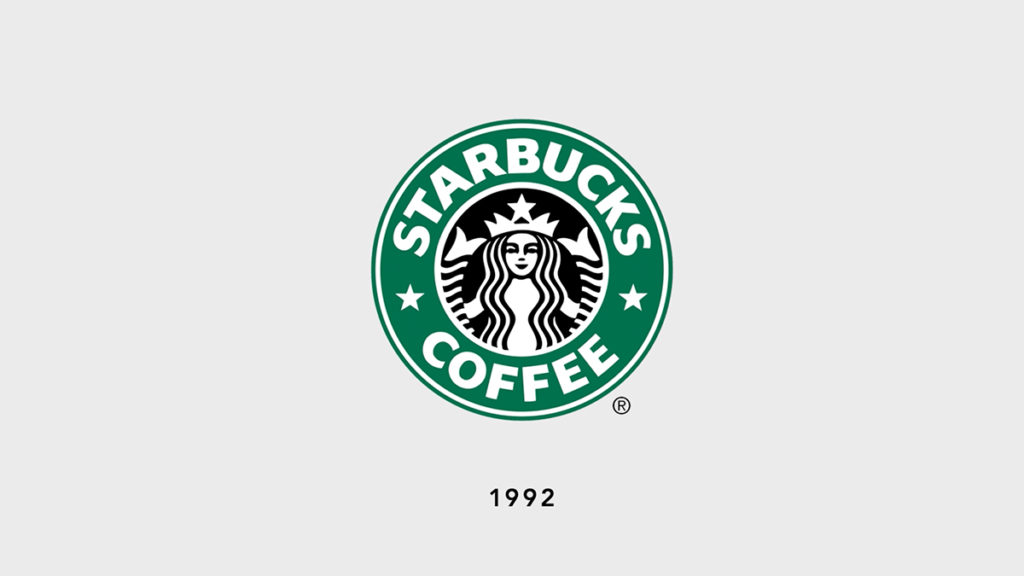
As Starbucks prepared to go public in 1992, the logo was simplified again and zoomed in on the siren's face and the tips of her tails. Her navel and breasts were no longer visible, and "Starbucks Coffee" wrapped the circular frame.
The 2011 redesign: dropping the wordmark
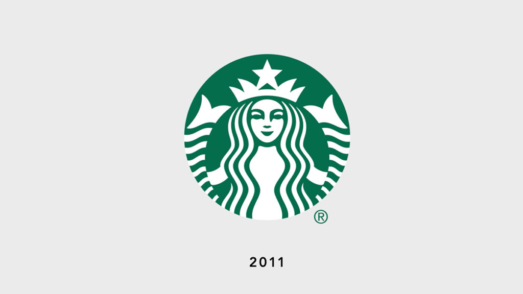
For its 40th anniversary in 2011, Starbucks removed the outer ring and the words "Starbucks Coffee," leaving only the green siren. Dropping the wordmark signaled that the symbol alone was recognizable enough to carry the brand, and it reflected a move beyond coffee into a wider range of drinks and food.
What the Starbucks siren means today
Across four decades, each redesign stripped the mark down further while keeping the siren, tracing the company's growth from a single Seattle store to a global chain. The siren now stands alone as the core of Starbucks' identity, recognizable without a single word of text.
For more logo histories, see our post on the Pampers logo. For the beverage industry, read about the brands PepsiCo owns, green drinks, and the Prime energy drink.